Forecast Predictions for the 2023 Australian Open
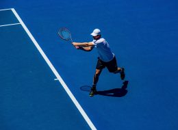
With all the Grand Slams for this year finished, it’s time to start looking ahead in anticipation of the Australian open which will open the way for the new Grand Slams in 2023. Some first-time winners in 2022 surprised us, leaving room for more surprises in the upcoming year. Whether we are about to see […]
Solar Predictions – What Is the Sun Going to Do?
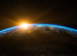
The sun is one of the constant features of our lives. Every day it is there, even if it is hidden behind clouds. In all its constancy, it does have many variations. Sometimes it emits more energy. That means more radiation that could damage our skin or health. So, knowing how the sun is going […]
Keep an Eye on the Sky – Predict the Weather Yourself
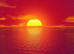
Nearly all of us check the weather every day. Is it going to rain and do I need an umbrella? Or is it going to be sunny, and I’d better bring a hat? Answers to those questions determine what we are going to do, where, and how we will dress in the morning. But we […]
Natural Disaster in Australia 2017-2022
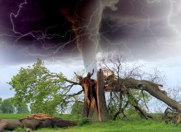
Weather affects our lives daily, usually in minor ways. It determines what we are going to do, where, and what we will wear. Sometimes weather affects our lives in a more profound way. Extreme weather can lead loss of homes, livelihoods, and even lives. Extreme weather is not a disaster in itself. It becomes so […]
Climate Change – Beyond the Global Warming
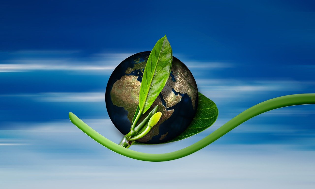
Global warming is an issue that we hear about nearly every day. Most scientists believe it affects the average temperature on our planet. According to some, this will have disastrous effects on many equilibrium processes, climate, and weather conditions. According to some of the harshest predictions, this process is becoming irreversible. That would mean that […]
Welcome to Landshape.org

I have been an amateur meteorologist for many years, and I really enjoy recording weather events. I also take an active interest and have studied physical sciences, such as physics and astronomy. I am Australian born and raised, and currently live in Sydney. I want to share my knowledge and experience especially since weather events […]